Five Checkout Errors That Cost Nigerian Online Stores Sales7 min read
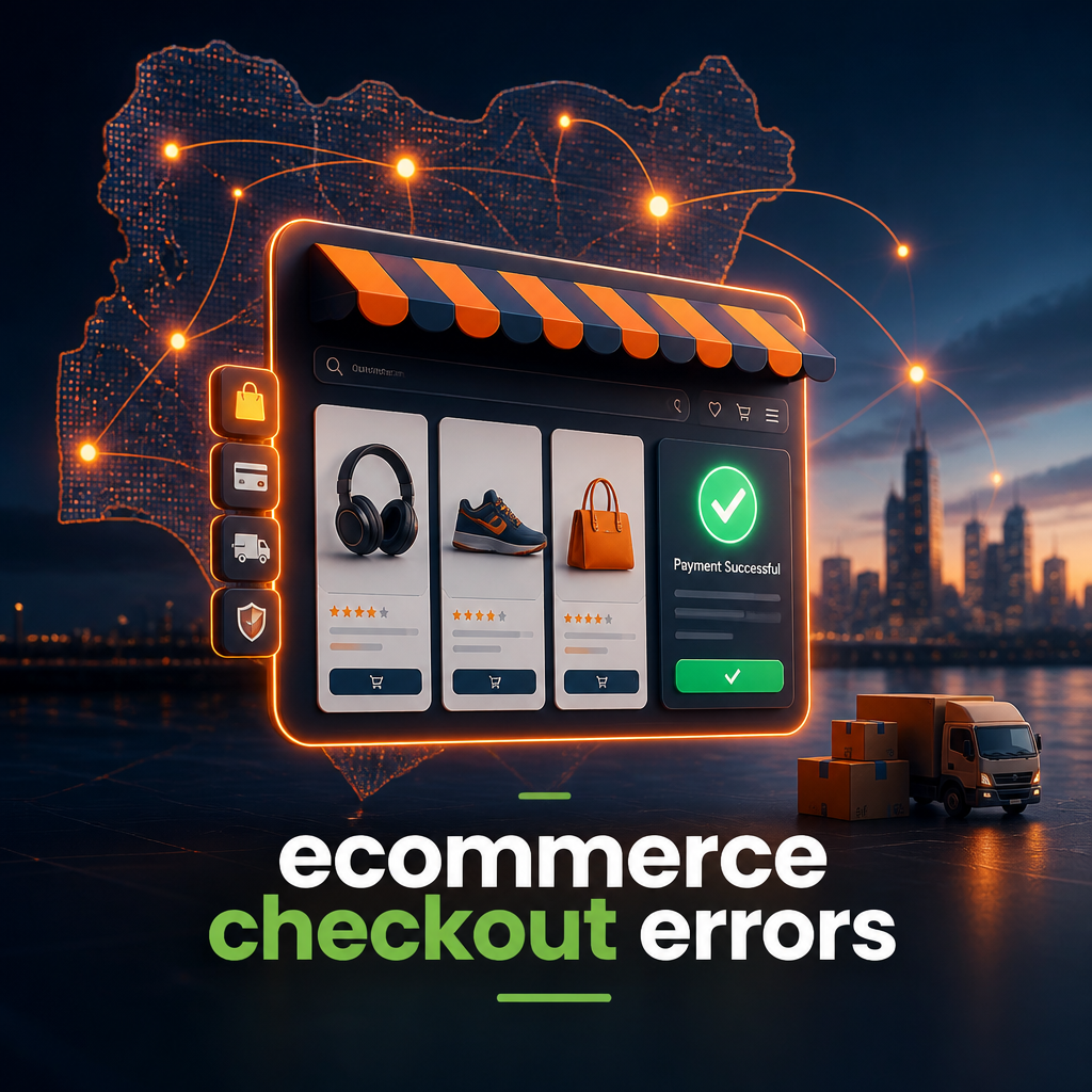
A customer can add items to a cart in seconds, then abandon the purchase when checkout feels uncertain or difficult. For Nigerian businesses, ecommerce checkout errors can turn paid advertising, social media referrals and repeat visits into lost sales. A buyer might be shopping on a phone, comparing delivery options or trying to complete payment with an unreliable connection.
These problems often come from small design decisions rather than a lack of customer interest. Hidden delivery fees, confusing payment messages and long forms can all create doubt at the moment a customer is ready to buy. Meanwhile, owners may not notice the friction until they compare cart activity with completed orders.
Albanny Technologies helps businesses build practical websites around how customers browse and buy. In this guide, you will learn five common checkout mistakes, how to check for them, and what Nigerian online stores can change to help more customers finish paying.
ecommerce checkout errors: confusing costs and payment failures
1. Showing delivery costs too late. A customer may accept a product price, but hesitate when delivery suddenly adds ₦3,500 or more at the final step. For example, a shopper ordering from Lagos to Ibadan needs to know whether delivery costs ₦2,000, ₦4,000 or depends on the address. If the charge appears only after the customer enters several details, the surprise can feel like a broken promise.
Instead, show a clear delivery estimate on product pages or in the cart. If the exact price depends on location, explain that early and ask for a postcode, town or state before checkout. Also state the expected delivery window. “Two to four working days in Lagos” gives shoppers more confidence than “delivery fee calculated later.”
2. Leaving customers without a clear payment recovery path. A failed card transaction does not always mean the customer has no money. The network may time out, a bank app may take too long to return, or the customer may need to try another payment method. However, a vague error such as “Transaction failed” leaves them unsure whether the order exists or their account was charged.
Therefore, display a helpful message and a clear next action. Confirm whether the order remains unpaid, offer a retry button, and show another available option, such as bank transfer or USSD. Then send a confirmation only after the payment provider confirms success. For practical website improvements, review Albanny Technologies’ web design services in Nigeria.
Pro tip: Test a payment using a low-value product, then deliberately interrupt the process. Check what appears after a timeout, duplicate tap or return from a banking app. In addition, review the payment provider’s transaction records against orders marked unpaid.
Remove unnecessary steps from ecommerce checkout errors
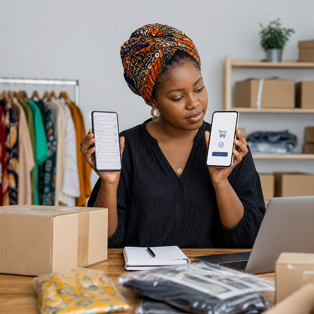
3. Asking for too much information. A checkout form that requests a customer’s birthday, gender or several contact numbers adds effort without helping fulfil the order. Meanwhile, long forms are especially frustrating on mobile, where shoppers type with one thumb and may have limited time or data.
Ask only for what the business needs to take payment and deliver the item. Usually, that means a name, phone number, delivery address and email if needed for a receipt. If the customer can buy as a guest, let them do so. Account creation can remain optional after the purchase, when the buyer already has a reason to return.
First, check every form field on a phone. Next, label fields clearly and explain which details are required. Also use address suggestions or saved customer information when your store supports them. As a result, a customer buying a ₦18,000 skincare bundle should not need to complete a lengthy profile before paying.
The National Bureau of Statistics provides official data and publications that help businesses understand Nigeria’s changing economic context. That context matters when stores decide what to display at checkout. For instance, clear naira pricing and accurate delivery charges help shoppers assess the full cost before committing.
4. Hiding the order total or changing it unexpectedly. Customers should see the product subtotal, delivery fee, discounts and final amount before they tap the payment button. In contrast, a total that changes after payment begins can damage trust, even when the difference comes from a legitimate fee.
Show prices in naira and explain any extra charge beside the relevant item. If a discount code does not apply, give a specific reason rather than silently removing the discount. Also make quantity changes easy, so shoppers can correct an order without restarting checkout. A useful customer voice to design around is: “Show me the full amount before I pay.” In other words, remove surprises before asking for commitment.
Check mobile usability and build customer confidence
5. Making checkout hard to trust or use on a phone. Nigerian shoppers often discover products through social media and complete orders on mobile. Therefore, tiny buttons, slow-loading pages and text that runs off the screen can stop a purchase before payment. A customer may also hesitate if the page lacks a visible support contact, delivery policy or secure payment indicator.
Test the complete journey on more than one phone and network connection. Try a typical Android device, use mobile data, and check the page at different screen sizes. Then confirm that buttons respond quickly and the order summary remains readable without excessive scrolling. Albanny’s mobile-ready website checks for Nigerian customers offer a useful starting point for reviewing the mobile experience.
In addition, explain how customers can contact the store if an order has a problem. A working phone number, WhatsApp link or support email can reassure a buyer who wants to confirm delivery details. However, make sure the contact option does not pull customers away from checkout without preserving their cart.
Finally, measure where shoppers leave. Compare product views, cart additions, checkout starts and completed orders each week. If many customers add products but few reach payment, test delivery information and form length first. If payment starts but orders remain incomplete, check error messages and provider records. Likewise, ask a few real customers to complete a test order and describe where they felt uncertain.
Small changes can make a meaningful difference. For example, a store selling clothing from Lagos can display delivery zones, let shoppers check out as guests, and show the full total before payment. Then it can test those changes with actual customers rather than assuming the design works. For broader planning, the listed cornerstone guide, “Affordable Web Design in Lagos: Complete Guide for Small Businesses,” is also relevant; its URL was not provided here.
Key Takeaways
Show delivery fees and estimated arrival times before the final checkout step.
Explain payment failures clearly and offer a safe retry or alternative method.
Collect only the details required to process and deliver each order.
Display the complete naira total before customers submit payment.
Test checkout on phones, mobile data and different payment journeys.
Improve Your Online Store’s Checkout Experience
Start by completing a test purchase on your own store and noting every point that causes hesitation. Albanny Technologies can help you review the customer journey through a free web design consultation, so you can prioritise practical checkout improvements.
Benson is a Senior Digital Strategist at Albanny Technologies with over 5 years of experience in high-end web development and technical SEO. Specializing in helping Nigerian businesses scale their digital footprint, he translates complex technology into actionable growth strategies. When he’s not auditing site performance, he’s mentoring the next generation of tech talent in West Africa